My new course: Accessibility-First Design
My new course, Accessibility-First Design, launched recently on LinkedIn Learning!
Accessibility doesn't compromise design. Instead, it's at the core of successful content and visual design.
This concise course provides tons of tactical skills across content design, visual design, and accessibility testing to make more successful digital products. While it's focused on design, I consider all product work to be a form of design, and every topic has bridging context to development.
I love when my educational content opens up wider conversation. If you take the course, let me know if you have any questions or feedback!
Core concept: accessibility-first
As the title reflects, this course focuses on an accessibility-first approach to product design.
Accessibility-first is a term I introduced in my work over the past year that's analogous to mobile-first design.
With mobile-first design, we design for smaller viewports to ensure that the user experience, content, and visual design are all thoughtfully crafted without compromise when there's less space to work with. This makes for a more focused, resilient, and cohesive experience for all users across all screen sizes.
With accessibility-first design, we design with accessibility in mind from the start as a core principle of our work. This spans content design, visual design, and development, with accessibility testing throughout the product development process to ensure we keep our work in an always-working, accessible state. Prioritizing accessibility improves the user experience for everyone.
Core concept: just-in-time Design
Just-in-time design is another approach and term I've introduced in my work over the past year. Even the most "Agile" teams often perform upfront design before beginning development, which leads to a lot of rework and waste in the process. Questions, constraints, and even opportunities arise later in the process, which requires repeated design changes or compromises.
With just-in-time design, teams do visual design in parallel with development. Specifically, by waiting for initial content and functionality to be implemented in the browser, teams can start with a working, accessible, unstyled version of their product. This verifies that the overall functionality, content structure, and accessibility are in place and will be protected as the product evolves.
At this point, just enough visual design is layered in to bring polish, branding, and delight to the user experience, but it's built on a working, de-risked foundation.
This is a radical approach, but I've implemented it in my consulting work with my clients' teams with a lot of success. The end result is a more better product across accessibility, user experience, performance, content design, and visual design, while also saving significant time and energy.
Behind the scenes
It's surprising how much work and distillation goes into creating just a 1 hour 24 minute course.
LinkedIn Learning first reached out in August of last year to ask if I would like to pitch a course. The course pitch process involved writing a course summary and an outline with learning objectives for each topic. It was interesting to outline the course from a user benefit perspective, and forced me to think about actionability and outcomes for every topic.
My course was greenlit in late September, so I kicked off production in October with a flurry of script writing. With the volume of production work ahead of me, I really depended on time blocking my calendar to guarantee I had consistent hours every week to stay on schedule.
Typically, I just have a simple bulleted list when I record educational content. Writing polished scripts that I would follow word-for-word was a new experience, and forced me to really unify my writing and speaking voices.
Although I do a lot of writing in my career, this also pushed me to produce writing consistently, on-demand, at scale. By mid-November, I finalized scripts for 26 videos with 13,500 words.
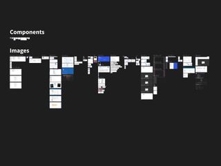
From there, the sole focus was creating visual assets. Across each of the 26 videos, I created an ID for every distinct idea that would benefit from a dedicated visual. This created an inventory of over 350 slides I needed to design.
First, I conducted an audit of all the unique user interface situations I cover in the course. This created a checklist for me to build a realistic design system in Figma that had a generic fictional brand, cohesive look, and all the statefulness of an interactive and accessible product. A number of these components also needed both good and bad versions to cover common mistakes.
This work was a form of just-in-time design. Because the visual design was driven by the script writing, I was able to design exactly what was needed and create a ton of efficiencies. I was surprised that just 10 distinct user interface patterns had enough accessibility considerations, states, and common mistakes to support hundreds of slides.
With my component warehouse in place, I worked fairly quickly and linearly through the slides. Most of the slides I designed could be adapted for related topics in other videos, so progress accelerated with each chapter I completed.
Working around the holidays and surges in client work, I finalized the slides in mid-January just before traveling to LinkedIn Learning to record onsite.
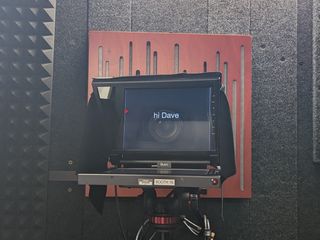
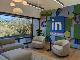
As someone who records a lot of content at home, the scale and resources of the recording process at LinkedIn Learning really impressed me. Their studio had dozens of soundproof booths with dedicated halves and equipment for producers and instructors to collaborate.
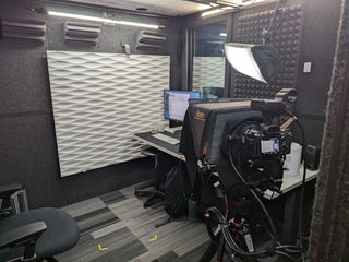
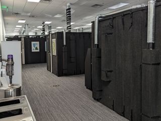
The campus also had dedicated sets and studios for on-camera content and photoshoots, and the scale of the whole operation made it clear how LinkedIn Learning can put out multiple new courses weekly.
After a couple days recording onsite, the course went into post-production and launched in late March!
Reflecting on my experience
This experience made me realize how courses are a strong form of progressive summarization. This course summarizes years of my career and learning, hundreds of hours of production work with thousands of words of writing and hundreds of dedicated visual assets, and distills it all down into less than 90 minutes.
I typically create longer, deep-dive content that could dig into a single technique for 90 minutes, so this format of intensely focused, shorter videos was a good stretch exercise for me.
The production process also created a productive habit in my writing. Since working on the course, I've carried this momentum forward into this year. Writing comes much more easily now, even at scheduled times, and I've found myself wanting to get back into creating video content again after a couple years of being focused on client work.
Feel free to check out Accessibility-First Design on LinkedIn Learning. I hope it provides value for anyone who works on digital products. Let me know your thoughts!