All about accessible headings
Watch the companion video to this post on YouTube
What is a heading?
A heading is text that describes a section of content.
In HTML, we have 6 heading elements (<h1>, <h2>, <h3>, <h4>, <h5>, <h6>) to create different heading levels. This allows us to create a hierarchical outline to structure our content.
Heading, header, title
It's important to always refer to these elements as headings. Don't confuse it with the term "header". In HTML, a <header> element is a landmark region that semantically groups introductory content, such as the top navigation, search, and settings of a website. Similarly, don't confuse it with the term "title". In HTML, the <title> element provides meta information about the page that is used in the browser's tab, and appears in search results. Unrelated, there's also the title attribute, which is a poorly supported HTML attribute that provides a tooltip on mouse hover, and is inconsistently announced by different assistive technology.
Why are headings useful?
Headings allow people to understand the structure of content and quickly identify relevant information.
For sighted users, headings are often styled distinctly from other text to allow people to visually scan a page and jump between areas of interest.
For assistive technology users, headings provide an overview of the webpage and even allow for quick navigation, such as navigating with the tree structure of all headings, moving to the previous or next heading, or moving to the previous or next heading of a specific heading level.
Like good accessibility in general, in addition to helping people, proper heading structure is also good for SEO. Headings allow search engine crawlers to understand the structure of a page, and search engines reward good heading use.
What makes for a good heading?
A good heading, like all good copywriting, should be descriptive, clear, and concise. It should also be unique, at least within the current section of content, to help users identify different chunks of information.
It's best to not overuse headings, especially with more granular content, as this dilutes their usefulness. If content can be grouped thematically, then it would benefit from a heading. If a piece of information or data needs a label, then a heading is likely too much, and other semantic HTML, such as the description list (dl) might be a better fit.
Myth: <hgroup> adds semantic content to headings
HTML 5 over ambitiously introduced the <hgroup> element, which was intended to associate a heading with one or more paragraphs to act as supplemental heading information:
<hgroup>
	<h2>Pricing</h2>
	<p>Plans that scale with your rapidly growing business</p>
</hgroup>
However, no assistive technology communicates any additional semantics with <hgroup>, so the heading and paragraph are treated normally. As a result, it's best to ignore this element.
What are heading levels?
Headings should be hierarchical, with different heading levels (1 to 6) to structure the relationship of content. The hierarchy of headings should be intuitive and consistent across similar sections.
How should we use heading levels?
Heading levels should create a logical outline for content that communicates the relationship of different sections, much like an indented bullet list.
Although HTML offers 6 levels of headings, try to create content that doesn't require more than 3 or 4. Content that repeatedly requires more than 3 heading levels probably means the content is too complex and can be edited or broken into distinct pages.
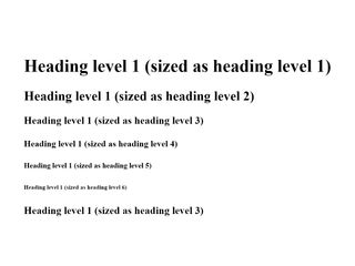
Rule: don't use headings for visual styling
As with all accessibility, visual styling and semantics are not the same, and should be treated separately.
Browsers have default CSS styles that provide a bold font weight for headings and a typographic scale that decreases font size from <h1> (the largest) to <h6> elements (the smallest).
As a result, some developers mistakenly choose the heading level based on the font-size they want instead of the appropriate level based on the content's structure.
Similarly, some developers mistakenly turn normal, paragraph text into a heading to make it bold instead of using the font-weight property in CSS.
Don't use headings for visual styling. Use headings to describe sections of content, use other text HTML elements (<p>, <li>, <dt>, <dd>, etc.) for non-heading text, and use CSS to achieve font size and font weight.
Rule: use a single, unique <h1> per page
Pages should have at least one heading, and every page's heading outline should begin with a single, unique heading that clearly and succinctly identifies the main focus of that page.
This <h1> heading should be unique to that page and shouldn't be used as the <h1> on any other page for the site.
Using more than one <h1> for a page creates an illogical structure, like a book having more than one title on the front cover.
Myth: the HTML outline algorithm
The HTML 5 spec included the HTML outline algorithm, which promised to automatically handle heading levels based on the nested structure of landmark region elements, such as <main>, <article>, <aside>, and <section>.
With this approach, developers would use <h1> elements for the first heading in each nested section, and the structure of the landmark elements would inform the proper heading level semantics. If you implement this structure in HTML, the default browser CSS styles will actually modify the font-size of <h1> elements that mimics the different headings levels.
However, the HTML outline algorithm was never implemented in assistive technology. This approach of using <h1> elements in each section results in a flat outline with multiple level-one headings, which is confusing and not very useful.
In 2018, the W3C and WHATWG "retired" HTML 5 and introduced the HTML living standard. With the living standard, we no longer have version numbers for HTML, and the HTML outline algorithm is not advised.
Instead, use <h1> to <h6> to create a logical outline for content. These heading levels can be used regardless of the structure of landmark region elements, but pair nicely with well-structured landmarks.
Rule: don't skip heading levels
A heading should not be more than 1 level deeper than the previous heading.
If the previous heading is <h3>, then the following heading can be <h2> (a new section unrelated to the previous heading), <h3> (a new section as a sibling to the previous heading), or <h4> (a new section within the previous heading). It can't be <h1>, because there should only be one <h1> as the first heading of the page, and it can't be <h5> or <h6>, because that would skip a heading level.
A good heading outline
Applying these rules together results in a logical heading outline that's similar to an indented list:
<h1>...</h1>
  <h2>...</h2>
    <h3>...</h3>
  <h2>...</h2>
  <h2>...</h2>
    <h3>...</h3>
      <h4>...</h4>
    <h3>...</h3>
  <h2>...</h2>
Headings and landmarks
While the HTML outline algorithm was never really a thing, headings and landmarks provide rich semantics when used together. Landmark region elements, such as <main>, <article>, <aside>, and <section>, benefit from dedicated headings.
In fact, the <section> element, has no semantic value as a landmark unless it has an accessible name. This is achieved with the aria-labelledby attribute, which points to the id attribute of a heading:
<section aria-labelledby="features-section-heading">
	<h2 id="features-section-heading">Features</h2>
</section>
With this approach, the overall HTML structure of a page utilizes landmark elements and headings working together:
<header>
	<nav>
		<!-- ... -->
	</nav>
</header>

<main>
	<h1>Example, Inc.</h1>

	<section aria-labelledby="features-section-heading">
		<h2 id="features-section-heading">Features</h2>

		<!-- ... -->
	</section>

	<section aria-labelledby="plans-section-heading">
		<h2 id="plans-section-heading">Plans</h2>

		<h3>Starter</h3>
		<!-- ... -->

		<h3>Growth</h3>
		<!-- ... -->
	</section>
</main>
Accessibility-first headings
An accessibility-first workflow incorporates accessibility from the start of any project and preserves it across content design, visual design, and development.
It's useful to determine and note heading levels directly in content documents.
If you're authoring content in Markdown, this is easily achieved with # for <h1>, ## for <h2>, ### for <h3>, and so on.
In Google Docs, it's possible to style text as "Heading 1" to "Heading 6" using the dropdown menu, or keyboard shortcuts (Ctrl/Cmd + Alt/Opt + 1 for <h1>). It's still a good idea to note what the heading level is with Markdown's # approach to make it clear and convenient to implement in code.
If you're authoring content directly in HTML (as I recommend), then there's no need to separately document heading levels. Getting content into the browser as soon as possible without any styling allows us to evaluate the structure and accessibility of the page early on, and provides a working baseline that we protect throughout the rest of the project.
With raw HTML in the browser, we can then incorporate visual design. Again, it's critical to separate semantics from visual styling. This is why noting heading levels when creating content or working directly in HTML is so important. It frees the visual design to style typography however is needed, whether it's heading or paragraph text. If a heading ultimately isn't going to be visually shown in the final design, it's already in place and can be accessibly hidden using CSS.
With this process, you are much more likely to have well-structured, accessible headings in any design and UI.
Solutions to common design patterns
Beyond heading levels being misused to achieve a particular font-size, I typically find issues with headings in some common design patterns. Luckily, there are easy solutions that allow us to achieve the visual design of these patterns while providing accessible headings.
Eyebrow text followed by large text
This design pattern appears a lot in marketing sites, especially sections describing different app or service features. The eyebrow text is small, brief text that appears before larger, more descriptive or narrative text.

I often find this incorrect HTML structure:
<div>
	<p>Pricing</p>
	<h2>Plans that scale with your rapidly growing business</h2>

	<!-- ... -->
</div>
To fix this, we can simply make the eyebrow text the heading, and the larger text a paragraph. We can also enhance this chunk of content with a landmark section:
<section aria-labelledby="pricing-section-heading">
	<h2 id="pricing-section-heading">Pricing</h2>
	<p>Plans that scale with your rapidly growing business</p>

	<!-- ... -->
</section>
Lack of (hidden) headings
Sometimes visual designs don't accommodate headings in particular visual regions, or an accurate heading feels too formal compared to more narrative, marketing-oriented text. This seems to be common with missing <h1> headings on pages that only show sub-sections or have a marketing tagline that doesn't do a good job of describing the site or page as a whole.
In this case, it's best to add headings to properly describe the site, page, or section as needed.
While I recommend visually shown headings whenever possible, this can introduce design challenges that might discourage fixing the issue of missing headings. As a start, at least improve the heading outline with accessible, visually hidden headings while exploring better long-term solutions.

Home link is <h1>
Sometimes I come across top navigation that uses a <h1> element in the home page link.
<header>
	<nav>
		<h1>
			<a href="/">Example, Inc.</a>
		</h1>

		<ul>
			<li>
				<a href="/pricing">Pricing</a>
			</li>
			<li>
				<a href="/about">About</a>
			</li>
		</ul>
	</nav>
</header>

<main>
	<!-- -->
</main>
This results in a few issues:
- The
<h1>isn't located near the main content that it describes - The
<h1>is the same across every page - The
<h1>of the website/brand name is only relevant for the home page
To correct this, the top navigation should simply contain links. On the home page, a <h1> with the website/brand name should be included in the <main> section. On other pages, the <h1> should provide a descriptive heading for that particular page.
<header>
	<nav>
		<ul>
			<li>
				<a href="/">Example, Inc.</a>
			</li>
			<li>
				<a href="/pricing">Pricing</a>
			</li>
			<li>
				<a href="/about">About</a>
			</li>
		</ul>
	</nav>
</header>

<main>
	<h1>Example, Inc.</h1>

	<!-- -->
</main>
Linked headings
Headings and links often go together for lists of articles or to provide anchor links within a page. However, people can make the mistake of wrapping the heading in a link.
<a href="/a-year-in-review">
	<h2>A year in review</h2>
</a>
Instead, the heading should contain the link:
<h2>
	<a href="/a-year-in-review">A year in review</a>
</h2>
Evaluating the heading outline
There are helpful tools and manual testing approaches to evaluate the heading outline whether you're improving an existing project or working on a new project.
The WAVE browser extension by WebAIM provides a helpful heading outline and annotates any headings directly on the page. It also flags incorrect heading usage and potential headings.
With these findings, it's helpful to created a bulleted list of the heading outline to share with others and demonstrate whether the current structure makes sense.
It's also valuable to review headings with a screen reader. You can evaluate the page's heading structure and experience if the wording is distinct and understandable.
In NVDA on Windows, use the Elements List with Insert + F5 to get all headings on a page and review their tree order or jump between headings. You can also use the H key to jump to the next heading and Shift + H to jump to the previous heading.
In VoiceOver on MacOS, use Rotor Mode with Control + Option + U to get a similar list of all headings.
Summary
- Don't confuse "heading" with "header" or "title"
- Write clear, concise, descriptive headings
- Only include a single
<h1>per page, that's unique to that page - Use heading levels to create a logical heading outline
- Plan heading levels early on and test the heading outline throughout a project
- Don't skip heading levels
- Aim for less complex content that doesn't require all 6 heading levels
- Don't use headings to achieve visual styling