Vision Pro, rabbit r1, LAMs, and accessibility
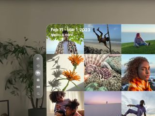
Today Apple released a video guided tour of the Vision Pro which gave a larger preview of the spatial user interfaces and how people will interact with them.
A little over a week ago, rabbit announced r1, a "personalized operating system" and companion device that primarily uses voice controls.
Both of these devices are interesting from an accessibility perspective. On one hand, they could provide new opportunities for people with limited mobility. On the other, the way they display UIs and handle user interactions makes me concerned that they will encourage bad practices that harm accessibility over time.
Concerns with spatial computing and the Apple Vision Pro
Back in June, I privately noted accessibility concerns with the initial announcement of the Apple Vision Pro and the Meet Safari for spatial computing video.
With today's video guided tour, I noticed the same issues and wanted to further detail them.
Text color contrast ratio
Like many Apple user interfaces, the text color contrast ratio is very low in menus, titles, and overlay text.
In the guided tour, there's white title text on top of the image grid with no defensive design considerations for how the text will appear on top of photos with bright content. As a result, the example text in the guided tour has a failing contrast ratio of 1.47:1. The lowest possible ratio is 1:1 with two identical colors, so this is a substantial readability issue. It needs to be at least 4.5:1 to meet the WCAG 2.1 AA standard.
For UI elements with a background, the frosted glass effect of a semi-transparent background with background blur similarly compromises on contrast. Even for buttons with more opaque backgrounds, the contrast ratio I measured was only around 2.16:1.
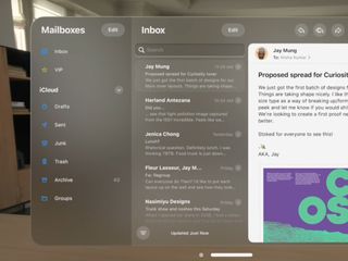
Native app UIs like Mail and Safari have similar issues. The highest contrast ratio I measured was 4.18:1, which only meets the AA standard for large text. All other instances of text had failing color contrast ratios.
"Cursor" hover indicators
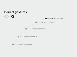
The Apple Vision Pro uses eye tracking to determine hover on interactive elements, and hand/finger gestures to determine click, drag, and swipe interactions.
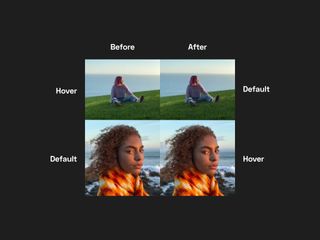
When an interactive element has hover from the user's gaze, it's indicated with a very, very subtle change in brightness, sometimes paired with a similarly subtle scaling. These changes are so slight that even though I have perfect vision with contact lenses, I have a hard time telling the difference.
When the user looks at different photos in the photo app, the brightness difference between hover and default states is almost imperceptible as it moves between photos.
This issue carries over to interacting with the web. In the June WWDC video demonstrating Safari for spatial computing, the hover indicator for links is incredibly difficult to see, with a contrast ratio of 1.09:1.
In the home view, app icons receive the same subtle increase in brightness and a slight scaling on hover.
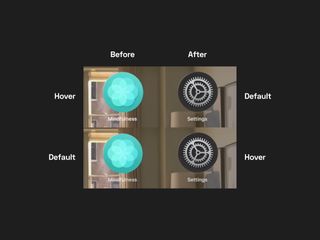
In menus, the indicator is more noticeable, but it unfortunately matches the active/selected state.
There's an argument that because hover is always where the user is currently looking, there's no ambiguity about where hover is, so it's preferable that it's subtle to not interfere with elements that users are looking at.
While this is true for interactive elements, the hover indicator is so subtle that it's very difficult to determine what elements are actually interactive. This is a particularly bad issue for the web, where each website has unique design, and determining what is or isn't a link through vision alone is nearly impossible due to the prevalence of ambiguous UI design.
Interactive regions in Safari for spatial computing
Safari for spatial computing maps pinch and pointer finger gestures to touch events with a coarse pointer and no hover. This helps clarify why vision tracking is essentially a cursor that hovers elements instead of focusing them.
Safari for spatial computing has clear criteria for determining which elements are interactive and should provide the (very subtle) hover indicator when the user looks at them:
- Buttons, links, and menus
- Elements with the equivalent ARIA roles
- Input fields and form elements
- Elements with CSS
cursor: pointer;
The first and third criteria are sensible, as semantic HTML should determine interactivity. I'm not sure what they mean by "menus" separately from "Elements with the equivalent ARIA roles", as we have no native menu elements in HTML.
I'm concerned with "Elements with the equivalent ARIA roles" that aren't buttons, links, or input fields, as well as "Elements with CSS cursor: pointer;.
Both these criteria enable interaction for elements that may not actually be accessible for keyboard and assistive technology users. The presence of an ARIA role on an element has no guarantee that it will properly announce its function or even handle mouse and keyboard click events. The same goes for using cursor: pointer;, which is completely presentational.
Developers can opt out of these hover indicators with pointer-events: none;, which does affect interactivity and feels asymmetric. The hover indicators are shaped with border-radius, which matches how outline now behaves.
This criteria fully supports a <div> with a click event listener, which is worrying.
I understand that Apple wants Safari for spatial computing to be as resilient as possible with the unpredictable web, but supporting bad practices can only encourage lacking accessibility. Developers are already prone to use "it works for me" as an excuse, and now an incredibly expensive device will only reinforce that flawed logic further.
This isn't specific to spatial computing, but the code used in the June WWDC video demo shows other bad practices, such as wrapping <li> with <a> to change the appearance of the hover indicator, and referring to each link as a "button". Here's some of the code for the example navigation:
<nav id="sidebar">
	<ul>
		<a href="home.html"><li>home</li></a>
		<a href="index.html" class="selected"><li>teas</li></a>
		<!-- ... -->
	</ul>
</nav>
First off, anything but <li> as a direct child of <ul>/<ol> isn't valid HTML. Second, there's no need to wrap the list items in <a> elements to change the visual appearance of a hover indicator. Simply size and style the link as desired and it'll automatically have a matching size and border radius on hover. Lastly, as a real nitpick, don't hard-code text casing in HTML to achieve visual design. Use the text-transform property.
I point these indirectly related issues out because this is supposed to be an instructional video for a developer conference on how to properly build websites for spatial computing. Having such fundamental mistakes from such a large authority as Apple should be concerning.
What you should do to provide a universal experience
Despite Safari for spatial computing accommodating fake interactive elements that simply have ARIA roles and cursor: pointer;, you should still always stick with semantic interactive elements, such as <a>, <button>, <detail>/<summary>, <input>, <select>, and <textarea>. Valid, semantic HTML remains crucial to accessibility.
To properly support all users, we need to provide accessible focus indicators (with outline) for keyboard and assistive technology users, hover for mouse users with the :hover pseudo selector, and hover indicators with cursor: pointer; for Safari for spatial computing users.
Luckily, all of these indicators inherit border-radius, including outline in recent browser versions.
Interestingly, using cursor: pointer; on interactive elements such as buttons and input fields has always been a source of debate. Some argue that adding it is inconsistent with native apps that have a cursor: default; appearance when hovering interactive elements. Since Apple is now encouraging/requiring cursor: pointer; for all interactive elements, I guess this is a sensible default for all buttons, links, and input fields.
Lastly, sufficient tap targets (44 by 44 pixels) are still universally helpful to accommodate interaction in all forms.
And now, let's talk about rabbit r1 and LAMs
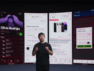
A little over a week ago, a new company called rabbit announced r1, a companion device they claim allows users to accomplish complex tasks on the web by speaking naturally.
The rabbit r1 announcement video discusses a specific type of AI called LAMs, or Large Action Models, which they've trained to accomplish tasks based on language input using user interfaces.
From my understanding, they've trained models to visually parse UIs to identify interactive elements and carry out actions. The example images from this model have red borders around every text and interactive element, such as (icon) buttons, links, and other controls.
It's unclear what goes into this identification. My guess is it's purely visual, as it spans native apps and websites, making it difficult to consider the underlying code. But, it would be possible to also parse native code and HTML to better parse UI elements.
Similar to Vision Pro, an over-reliance on visual parsing might make for a more resilient and adaptive tool for interacting with the unpredictable web, but accommodation also allows for us to let our accessibility standards slip further.
If devices like r1 become successful and prevalent, then companies might optimizing for visual presentation over accessibility even more than we do now. This could create further gaps in accessibility and strengthen the confusion between visual design and semantics.
The announcement video had several magic edits when demonstrating the device actually carrying out a task, so it's still completely unproven.
If it does actually work, then it could be an interesting new opportunity for users with disabilities, with LAMs having potential for enhancing assistive technology.
Nonetheless, this device and the underlying technology will need to prove itself valuable and reliable before I put any weight into the claims or get excited about future possibilities.
Can we have a unified model of understanding UIs?
We these emerging vision-based technologies, I wish we could lean more heavily on proper, semantic code and the accessibility tree to determine, well, semantics and interaction. Finding <div> elements with click handlers is easier than finding correct heading levels, and I'm worried this is only going to get worse.
Accessibility and valid HTML are shockingly bad across the majority of websites. While this emerging wave of devices might open up access by adapting to inaccessible code with lacking semantics, they might also further encourage teams to ignore accessibility, prioritize visual presentation over everything, and buy into the delusion that if it works for me, it works for everyone.