A deep dive on the UX of number inputs
One of my favorite things about design engineering is how deep the UX considerations can be. I love thinking through and improving every little detail of even an isolated element.
A surprisingly deep topic is the UX of a number input.
You could simply use a default <input type="number"> and be done, but there are many surrounding usability and accessibility considerations to explore.
First off, any interactive element needs an accessible name. So, at the very least, we need the following:
<label for="quantity">Quantity</label>
<input id="quantity" type="number">
Next, we have validation. There are a lot of scenarios to consider here:
- Is there a minimum acceptable value?
- Is there a maximum acceptable value?
- Should we allow decimals or enforce some other step amount?
- How should we handle non-numeric or invalid input values?
Luckily, <input type="number"> has native attributes to help with this:
<label for="quantity">Quantity</label>
<input id="quantity" type="number" min="0" max="100" step="0.01">
The step attribute provides further functionality. It not only enforces validation on the input's value, but it changes the increment/decrement amount of the up and down arrow keys, as well as the native "spin" buttons (increment/decrement buttons within the input) that accept clicks.
For example, using step="0.01" would allow any number up to 2 decimal places, but it comes with a usability tradeoff: we can now only increment/decrement by 0.01 at a time. This is great if users need fine-grained control over an input value, but cumbersome if users need to rapidly change the input value by whole values. Using step="any" can help with this, as it reverts the increment/decrement amount to the default of 1, but allows arbitrary decimal values.
The min, max, and step attributes allow us to use the :invalid and :valid pseudo classes to provide visual feedback about the input's state. You may also want to provide feedback to the user of what kind of values are accepted:
<label for="quantity">Quantity</label>
<input id="quantity" type="number" min="0" max="100" step="0.01" aria-describedby="quantity-help-text">

<p id="quantity-help-text">Please provide a value between 0 and 100. Decimal values are allowed.</p>
Enhancing type="number"
We can improve the UX of a native number input with some customizations.
Larger increment/decrement amounts
Let's say users often need to adjust the input's value by a large amount. We could increase step to 10, but then users can't increment/decrement by less than 10 with the keyboard of spin buttons. Instead, we could add support for Shift + ArrowUp and Shift + ArrowDown as a larger increment/decrement interaction. We just need to add an event listener for keydown on the input and change the input value by 10.
But, now that we're manually changing the input's value, we're now responsible for enforcing the min and max values. Let's start with the "big" increment use case (Shift + ArrowUp). We have a few scenarios to handle:
- Prevent the default behavior of incrementing the input value by 1.
- The input's current value is already the
maxvalue. Don't do anything. - If we increment the input's value by 10, we would exceed the
max. Set the input's value to themax. - If we increment the input's value by 10, we are below the
max. Increment the input's value by 10.
And of course, we need to handle the inverse considerations for the min value. Here's some pseudo code of this event handler:
numberInput.addEventListener("keydown", (event) => {
	const currentValue = Number.parseInt(numberInput.value, 10);
	const stepAmount = 10;

	if (event.shiftKey) {
		if (event.key === "ArrowUp") {
			event.preventDefault();

			const maxValue = Number.parseInt(numberInput.getAttribute("max"), 10);

			if (currentValue === maxValue) {
				return;
			}

			if (currentValue + stepAmount > maxValue) {
				numberInput.value = maxValue;

				return;
			}

			numberInput.value = numberInput.value + stepAmount;

			return;
		}

		if (event.key === "ArrowDown") {
			event.preventDefault();

			const minValue = Number.parseInt(numberInput.getAttribute("min"), 10);

			if (currentValue === minValue) {
				return;
			}

			if (currentValue - stepAmount < minValue) {
				numberInput.value = minValue;

				return;
			}

			numberInput.value = numberInput.value - stepAmount;

			return;
		}
	}
});
Using keydown instead of keyup is another UX consideration. Native number inputs respond to keydown, which allows key repeat to quickly change the input value without having to repeatedly press a key. We want to match this behavior with our event listener.
Smaller increment/decrement values
We can also add functionality in the other direction by allowing even finer-grained incrementing and decrementing. We can follow the same approach as above with a dedicated keyboard shortcut, say Control + ArrowUp and Control + ArrowDown, and update the input value by a small amount (0.1, 0.01, etc.).
Having multiple levels of granularity can create a very fluid and efficient interaction pattern for rapidly adjusting a value to a precise target.
Replacing native spin buttons
Native number inputs have "spin" buttons, which are the small increment/decrement buttons nested inside the input.
While these dedicated controls are a nice consideration, they have incredibly small tap targets which are difficult to use. We can replace these with our own increment and decrement buttons.
First, we need to hide the native spin buttons. We can use appearance: textfield to achieve this.
Next, let's provide some dedicated <button> elements:
<label for="quantity">Quantity</label>
<input id="quantity" type="number" min="0" max="100" step="0.01" aria-describedby="quantity-help-text">

<button type="button">Decrease quantity</button>
<button type="button">Increase quantity</button>
Like our Shift + ArrowUp and Shift + ArrowDown event handlers, the click event handler for these buttons needs to respect the min and max values. Luckily, the click event handler fires on keydown for Enter and Space, so holding a key will rapidly change the value.
Lastly, we should consider tab order for these controls. Visually, we may want to have the decrease button, input, and increase button appear in that order. While it's best to have visual order and tab order match, it may create a confusing user experience if the first control to receive focus is a decrease button, and not an input with an accessible name. For that reason, I think it's worth the tradeoff of placing the increment and decrement buttons after the number input in the DOM, and using CSS to change their visual order. This way, the user first tabs into the number input and then proceeds the increment/decrement controls.
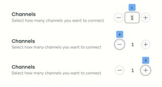
It could also be argued that these increment/decrement buttons are primarily tap targets and should be excluded from the tab order. In that case, they could use tabindex="-1" so the number input is the only focusable control.
Always working state
If the number input is used in a user-submittable form, it's best to provide visual and text feedback if the input's value is invalid. This allows the user to correct the value to be able to submit the form.
However, if the number input is part of an interactive control for something on the current page, we can improve the user experience by keeping the input in an always valid state.
Natively, <input type="number"> allows the user to type any character, and simply enters an :invalid state if the value is non-numeric and doesn't respect the min, max, and step attributes.
To improve on this, we could prevent invalid key presses from altering the input's value. As a user, this may cause some initial confusion, but can teach the user what is valid input.
We could also immediately correct values outside of our desired range, such as increasing a value that is below our min to the min value. However, this can be a frustrating user experience when editing a field. If our min is 10, the user may want to delete the input value to type 23, but are prevented from doing that if they type 2 on its own. THis forces users to come up with frustrating workarounds, such as temporarily typing 123, moving to the first digit, and deleting 1 to input 23. Preventing this issue becomes its own rabbit hole. Do we debounce the input value before correcting the value? What debounce length is appropriate?
Alternatively, we can correct the input's value on focusout or Enter. This allows the user to input any value, and then corrects the value once focus has left the field or the user has "submitted" the value. If the user increments or decrements the value, we still want to update the interface immediately. But, if the value is invalid, we don't do anything until focusout or Enter and then convert the value to something sensible:
- If the value is non-numeric, revert to the default value (or, the last valid value if there isn't a default)
- If the value is larger than the
max, reduce it to themax - If the value is less than the
min, increase it to themin
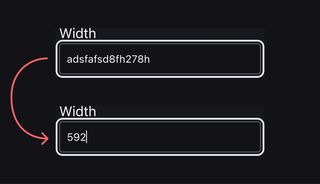
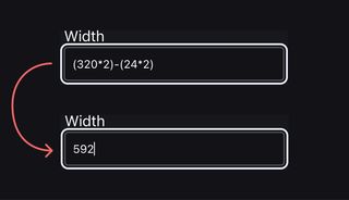
Allowing math expressions
For more advanced web apps, such as a design tool, allowing users to enter math expressions in a number input saves them the effort of opening up a dedicated calculator, keeping them in the flow. This enhancement adds a lot of implementation complexity, but can be a major UX upgrade in situations where math is frequently needed.
Similar to keeping the input in an always working state, we would want to wait for focusout or Enter to evaluate the expression. When we do our validation checks, we also need to parse the input's value to check if it's a valid math expression. If it is, we evaluate the expression (think PEMDAS), then use the resulting value for our remaining checks (enforcing min, max, and step).
When to go beyond type="number"
All together, <input type="number"> is a good fit if users need to select or provide a value from a discrete range. But, in some cases, such as a phone number, incrementing and decrementing the value isn't useful or expected behavior.
In this case, we may want to use <input type="text">. This means we'll have complete control over the input's functionality, but we also have to manually handle all validation and functionality.
This includes rolling our own versions of min, max, and step and the resulting validation states.
We also need to use inputmode="numeric" or inputmode="decimal" to bring up the appropriate keyboard on mobile devices, and pattern to enforce input value rules with Regex.
Custom formatting
Whether using type="number" or type="text", it may be helpful to provide automatic formatting, such as adding separators to large values for readability or adding hyphens, spaces, and/or parentheses to common formats such as phone, postal, credit card, or ID numbers.
This can either be done dynamically as the input value changes or on focusout or Enter.
With dynamic formatting, it's important to advance the cursor properly to allow the user to continue typing as expected. Similarly, if the user deletes a character, it may be helpful to automatically remove any adjacent formatting characters. Basically, automatic formatting should be transparent with the typing experience: don't make users move the cursor around automatic formatting characters or be responsible for deleting them.
With formatting on focusout or Enter, the user is allowed to type as expected without interference, and automatic formatting is only applied once they're done. Similar to dynamic formatting, the formatting characters shouldn't affect editing or typing and be purely presentational.
There's probably more to consider
Even with all this in mind, there are probably other UX wrinkles to smooth and enhancements to provide. Much of this is use case dependent, and all of it benefits from testing with a wide variety of users, especially with a variety of assistive technology and devices.
The depth of a single number input shows just how far design engineering can go. It's this level of thoughtfulness and refinement that makes this my favorite kind of work to do.